Part 2 of 2 · Five contemporary visions
A corridor can lose its gravity. A hotel can preserve an entire vanished world. A beautiful house can make inequality visible before anyone mentions money.
Part 1 followed five classic directors who understood the dramatic possibilities of buildings. Here, Christopher Nolan, Wes Anderson, Bong Joon Ho, Denis Villeneuve and Sofia Coppola take that relationship in different directions. Their films make space a system of rules, a container for memory, a social diagram, an instrument of power or an enclosure that quietly limits a life.
These are collaborative achievements. Production designers, cinematographers, art departments, builders and visual effects artists give each world its physical and visual character. The architectural readings below consider what those spaces do to the people within them.
Christopher Nolan: a room with its own rules
Inception, 2010 · Production design: Guy Hendrix Dyas · Cinematography: Wally Pfister
Nolan’s dream worlds are extraordinary, but their power depends on ordinary things being recognisable. A hotel corridor needs doors, carpet, wall lights and a clear direction of travel before its rotation can unsettle us. We first understand the room; then the film changes what our bodies can do inside it.

In American Cinematographer’s interview with Pfister, the rotating corridor emerges as a physical construction supported by carefully planned camera movement. Distinct visual treatments also help separate the film’s dream environments. The apparent confusion relies on a great deal of organisation.

This is a useful distinction for architecture. Surprise works best when some points of reference remain dependable. A sudden change in ceiling height, a concealed courtyard or a turn towards daylight can transform an arrival without making the house difficult to navigate. Nolan’s spaces become exciting because their familiar order is precise enough for us to notice its disruption.

Look for the rule: Identify the route and repeated elements before the scene changes them. A clear spatial structure can support a memorable surprise.
Wes Anderson: architecture as an organised memory
The Grand Budapest Hotel, 2014 · Production design: Adam Stockhausen
Anderson’s hotel feels like a place remembered with unusual precision: a façade that can be grasped at once, an elaborate interior hierarchy and rooms whose colours seem to belong to a particular chapter of a life. Its architecture supplies an organising frame for a story that repeatedly moves backwards through time.
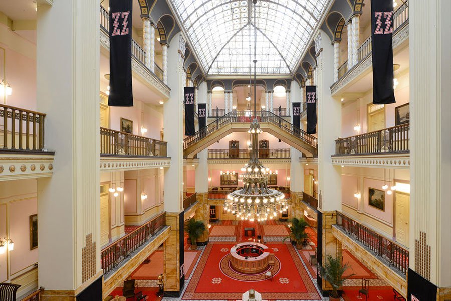
Criterion’s account of the changing lobby explains how a former department store in Görlitz supplied the underlying space, which was dressed for different periods. The building becomes a record of change rather than a single timeless composition.
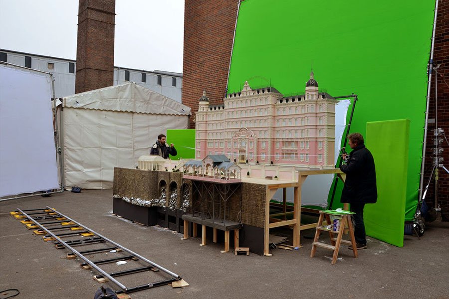
Symmetry helps us find our bearings, but the emotional effect comes from everything that disturbs its assurance. An empty reception desk feels different from a busy one. A grand stair can express welcome, ceremony or the absence of a world that once filled it. Decoration becomes narrative evidence when we can compare one period with another.
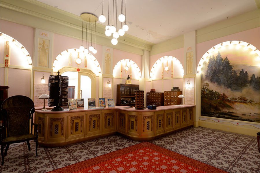
Look at the sequence: Façade, lobby and desk each announce arrival at a different scale. A home can use the same clarity without borrowing the hotel’s elaborate decoration.
Bong Joon Ho: the house as a social section
Parasite, 2019 · Production design: Lee Ha Jun
In Parasite, architecture gives advantage a physical form. The Park family’s lawn, broad glazing and carefully controlled outlook establish privacy and breathing room. The Kim family’s neighbourhood presses much closer to the street. Space, elevation and exposure explain a social difference with remarkable economy.
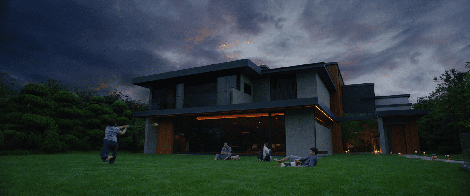
The Design Museum describes Lee Ha Jun’s scheme as developing from Bong’s simple sketch. Routes and sightlines were shaped around the story. The fictional architect named within the film should not be confused with the people who designed and built its sets.

Read the film like a section drawing: who climbs, who descends and who looks out from below the level of the street? A stair is both a practical connection and a reminder of somebody’s position. The house’s attractive openness also creates vulnerability. Seeing a large area does not mean understanding everything it contains.

Read the levels: Consider access, overlooking and exposure alongside the floor plan. A home’s relationship with the street can matter as much as the size of its living room.
Denis Villeneuve: scale and the solitary figure
Blade Runner 2049, 2017 · Production design: Dennis Gassner · Cinematography: Roger Deakins
Villeneuve’s architecture is often measured against a person who appears unable to fill it. Immense surfaces and deep shadows make the figure seem temporary. Yet the city outside is crowded with structures, signs and accumulated use. Vastness and congestion become two different ways to make someone feel alone.

In Deakins’s American Cinematographer interview, architecture and lighting emerge as closely coordinated decisions. The production drew on Brutalist buildings and dense urban environments, while K’s apartment was conceived with compact modular interiors in mind. These references supply recognisable logic beneath the invented future.

The lesson is not to make every room monumental. A large room needs an intelligible place for the body: a seat, an edge, a pool of light or a surface within reach. Without that smaller scale, generous dimensions can become uncomfortable. Villeneuve deliberately stretches this relationship until we feel its imbalance.

Measure the room against a person: Ceiling height matters, but so do furniture, shadow and the distance to the nearest reassuring edge.
Sofia Coppola: a beautiful room that belongs to someone else
Priscilla, 2023 · Production design: Tamara Deverell · Cinematography: Philippe Le Sourd
Coppola often lets interiors register feelings that characters cannot comfortably express. In Priscilla, the domestic world is luxurious, composed and strangely difficult to claim. A person can occupy a room without feeling that it belongs to her.

At the New York Film Festival discussion reported by Eye For Film, Deverell described the cream palette, the limited early photographic research and the freedom to invent parts of the upstairs interior. The result serves Coppola’s interpretation of the story; it should not be treated as a complete historical survey of Graceland.

Look at the difference between access and ownership. Who decides how a room looks, when its door opens and whether the person inside can leave? Furnishing a house beautifully does not answer those questions. Coppola makes the pause between activities visible: waiting becomes part of the architecture’s occupation.

Ask who can make themselves at home: Comfort includes control, privacy and the ability to alter a room, as well as attractive finishes.
Five ways of making space tell a story
Nolan establishes rules and then disrupts them. Anderson makes buildings hold memory. Bong turns levels and sightlines into social relationships. Villeneuve tests the figure against immense space. Coppola asks whether an exquisite interior can ever feel like home to the person waiting within it.
These films reward a second viewing with attention directed towards the edges of the action. Follow the doorways. Compare the height of the camera with the height of a window. Notice which rooms connect directly and which require a long journey. Architecture is doing narrative work even when nobody speaks about it.
For a real home, the practical test remains straightforward: can its occupants find their way, choose their company, enjoy daylight and feel that the place accommodates their lives? Cinema makes the stakes unusually visible.
Also in this series: When Directors Think Like Architects, Part 1: The Classic Masters, covering Fritz Lang, Jacques Tati, Alfred Hitchcock, Jean Luc Godard and Stanley Kubrick.
Related reading: Architecture in Movies: How Film Sets Inspire Design.
Image notes: Fifteen images accompany the five directors. Captions distinguish film imagery, constructed sets, miniatures and production photography. Architectural readings are editorial interpretation; production sources are linked beside the discussion.
The reading room
Keep exploring.
Four books to continue this story

The Nolan Variations
Nolan’s notes, storyboards and creative influences expand the discussion of constructed worlds and the rules behind Inception.
View on Amazon AU ↗ paid link
The Wes Anderson Collection
Interviews, photographs and artwork help trace the visual decisions behind Anderson’s composed cinematic worlds.
View on Amazon AU ↗ paid link
Parasite: A Graphic Novel in Storyboards
Follow the director’s drawn sequences to study how rooms, stairs and sightlines organise the story before filming.
View on Amazon AU ↗ paid link
The Art and Soul of Blade Runner 2049: Revised and Expanded Edition
Concept art, storyboards and production photography offer a detailed companion to Villeneuve’s immense interiors and urban environments.
View on Amazon AU ↗ paid linkAs an Amazon Associate I earn from qualifying purchases. Editions and availability vary.


No comments:
Post a Comment
Thanks for taking the time and effort to comment :)